Luxury Pink Kitchen: What I Learned Going Bold (And Almost Regretting It)
The day the painters left, I stood in my kitchen and genuinely thought I’d made a huge mistake. I’d gone with a dusty rose pink for the cabinets, something I’d been eyeing on Pinterest for months, and in person, under my kitchen’s fluorescent overhead lighting, it looked almost bubblegum. Not the elegant, muted look I’d pictured. I actually sat on my counter and considered repainting everything white the next morning.
I didn’t, mostly because repainting kitchen cabinets is expensive and exhausting, and I figured I’d live with it for a few weeks before deciding for sure. That decision to wait turned out to be the best one I made in the whole process, because once I fixed the lighting and a few other details around the pink, it went from a mistake I regretted to the room every single guest comments on now.
If you’re considering a pink kitchen, or you’ve already committed and are panicking like I did, here’s everything I actually learned making it work.
Pink Reads Completely Differently Depending on What’s Around It
My first realization was that the pink itself wasn’t really the problem. It was everything surrounding it that made it look cheap instead of luxurious. Cool white lighting, chrome hardware, and a plain white countertop were all fighting against the warmth of the cabinet color instead of supporting it.
Once I understood that pink needs the right supporting cast to look expensive instead of childish, the fixes became a lot clearer.
Step-by-Step: How I Actually Made It Work
1. Fix your lighting temperature first
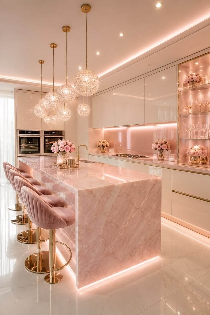
This was the single biggest change. My original overhead lighting was cool white, somewhere around , which made the pink look flat and almost artificial. I swapped every bulb in the kitchen to warm white, around and the pink instantly looked richer and more like the dusty, muted tone I’d originally wanted. If you’re mid-panic after painting, check your bulbs before you touch the paint again. It genuinely might be the actual issue.
2. Switch to warm metal hardware
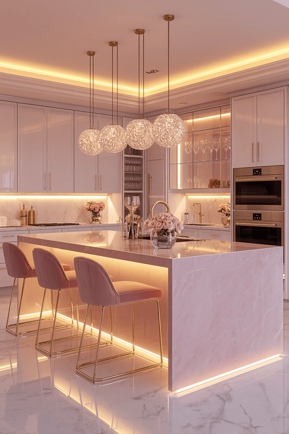
Chrome against pink made everything look colder and slightly cheap, almost like a toy kitchen. I replaced my cabinet pulls and faucet with brushed gold, and the warmth of the gold against the pink made the whole thing read as intentional and elegant instead of accidental. Brushed brass or even a warm bronze works here too, the key is moving away from cool-toned silver metals.
3. Add a neutral stone countertop with warm veining
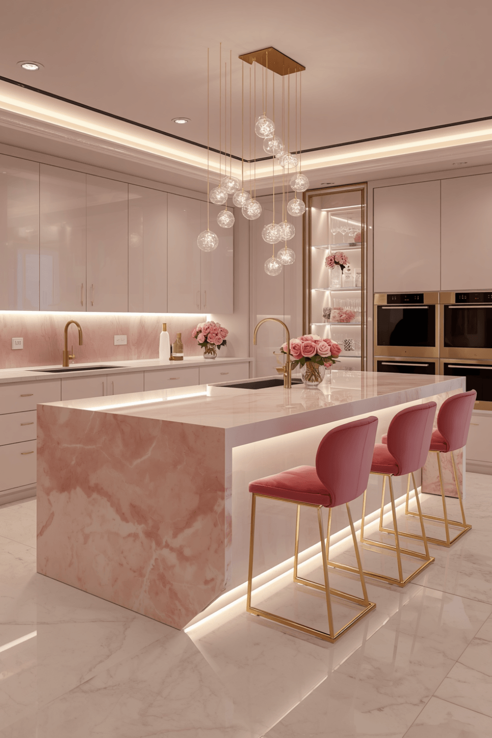
My original white quartz countertop was too stark and cool against the pink. I switched to a countertop with warm cream and soft grey veining running through it, and it gave the pink something to visually connect with instead of just sitting there on its own against a flat white surface.
4. Balance the pink with a grounding dark tone
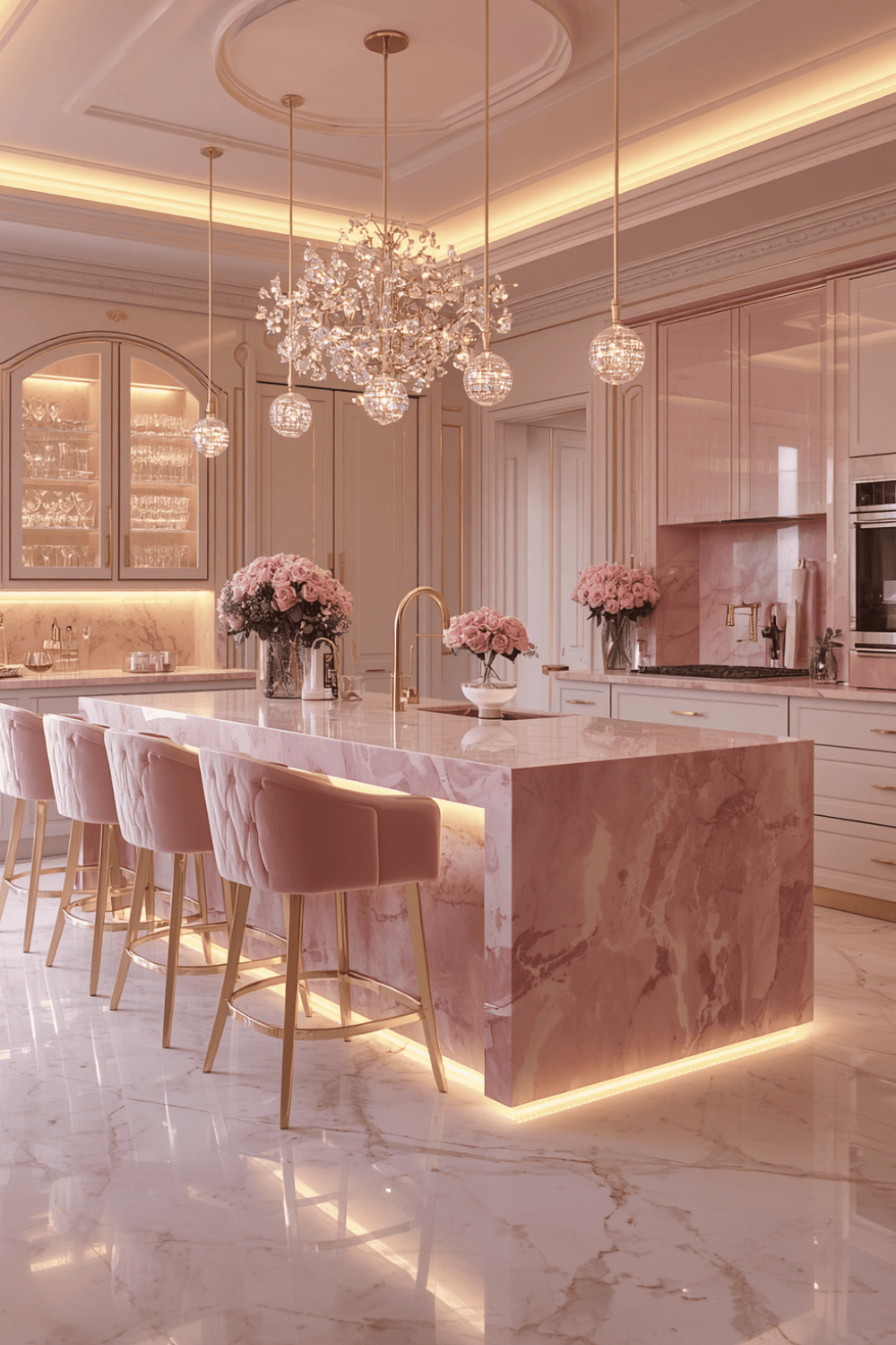
A kitchen that’s entirely pink and light neutrals can start to feel a little flat or overly sweet. I added a dark walnut wood island in the center, which gave the whole room a visual anchor and stopped the pink from being the only thing your eye landed on.
5. Keep the backsplash simple
I almost went with a patterned pink and gold tile backsplash, which in hindsight would have been way too much pattern on top of an already bold cabinet color. I went with a simple warm white subway tile instead, which lets the cabinets stay the star of the room instead of competing with a busy backsplash.
6. Bring in brass or gold light fixtures as a repeated element
Beyond just the cabinet hardware, I added a brass pendant light over the island and a small brass-framed mirror on one wall. Repeating the warm metal tone in a few different spots, not just the hardware, ties the whole room together and makes it look like a deliberate design choice rather than one bold color decision surrounded by leftover neutral choices.
7. Add greenery to soften the boldness
A pink kitchen without any greenery can feel a bit one-note. I added a small potted herb garden on the windowsill, basil and rosemary mostly, which adds a genuinely useful pop of green against all that pink and warm wood.
A Real Example: My Kitchen Now
Right now my kitchen has dusty rose pink cabinets, brushed gold hardware and fixtures throughout, a cream and grey veined quartz countertop, a dark walnut wood island, simple white subway tile backsplash, a brass pendant light over the island, and warm white 2700K lighting throughout. Total cost to fix the “bubblegum panic” phase after the initial cabinet paint job was around $1,400, mostly the hardware swap, countertop, and lighting fixtures.
It went from a color I almost repainted within a week to the exact reason people ask to see photos of my kitchen now.
Common Mistakes to Avoid
Judging the color under the wrong lighting. Cool white bulbs can make almost any pink look cheaper and flatter than it actually is. Always check your paint or cabinet samples under warm lighting before deciding it’s wrong.
Pairing pink with cool-toned metals. Chrome and pink together often read as a kids’ room rather than a luxury kitchen. Warm metals fix this almost instantly.
Skipping a grounding dark tone. An all-pink-and-light kitchen can feel flat or overly sweet without at least one darker anchor point, like a wood island or dark hardware accents.
Overdoing the pattern. Pink cabinets are already a bold statement. Adding a heavily patterned backsplash or busy tile on top of that usually creates visual competition instead of cohesion.
Choosing a stark white countertop. A pure white, cool-toned countertop against warm pink cabinets can look disconnected. Warmer stone tones with soft veining tend to work better.
Panicking and repainting too soon. I almost repainted mine within a week. Living with a bold color for a few weeks while you fix the supporting details around it, lighting, hardware, countertops, often solves the “wrong” feeling without touching the paint at all.
Final Thoughts
A pink kitchen can look genuinely luxurious, but the color itself is only doing part of the work. What actually makes it feel elevated instead of childish is everything you build around it, the warmth of the lighting, the metal tones, the countertop, the small grounding details.
If your pink kitchen currently feels more bubblegum than boutique, you probably don’t need to repaint it. You probably just need to fix what’s surrounding it.