Yellow Living Room Ideas: What I Learned After Mine Looked More Like a School Bus Than Sunshine
I painted my living room a cheerful yellow I saw in a magazine spread, convinced it would feel warm and welcoming the moment I walked in. Instead, under my room’s actual lighting, that same shade read as almost neon, closer to a school bus than the soft, sunny glow I’d pictured. Guests kept squinting slightly every time they walked in, which is not exactly the reaction I was going for.
It took a repaint and some real trial and error with shade selection and balance before yellow actually worked the way I originally imagined. Here’s what I learned about making this notoriously tricky color actually feel warm and inviting instead of overwhelming.
Yellow Is One of the Trickiest Colors to Get Right
I genuinely underestimated how much yellow shifts depending on lighting and surrounding materials compared to other paint colors. A shade that looks soft and buttery on a small paint chip can turn shockingly bright and saturated once it covers an entire wall, especially under certain lighting conditions.
Once I understood that yellow needed more careful testing and more intentional balancing than most other colors I’d worked with, my second attempt turned out completely differently from my first.
My Mistake: Choosing a Saturated Shade Without Testing It Properly
My original color choice was a bright, cheerful yellow that looked lovely on the small chip I held up in the paint store. I never actually tested a larger swatch on my wall before committing to painting the entire room, and the difference between a small chip and a full wall was honestly dramatic once I saw it in my actual lighting.
I repainted with a much more muted, buttery yellow, tested extensively on my actual walls first, and the difference in how the room felt was immediate. Same general color family, completely different result.
Step-by-Step: Making Yellow Work in a Living Room
1. Test large paint swatches before committing to a full room
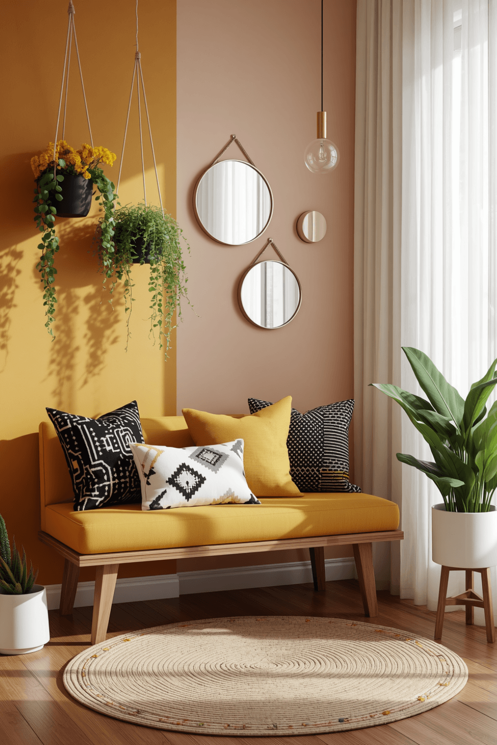 I now paint large poster-board swatches, at least two feet square, and move them around the room throughout the day rather than relying on a small chip alone. Yellow shifts more dramatically under different lighting than most colors, so this step matters more here than it would for a lot of other paint choices.
2. Lean toward muted, buttery tones over bright, saturated ones
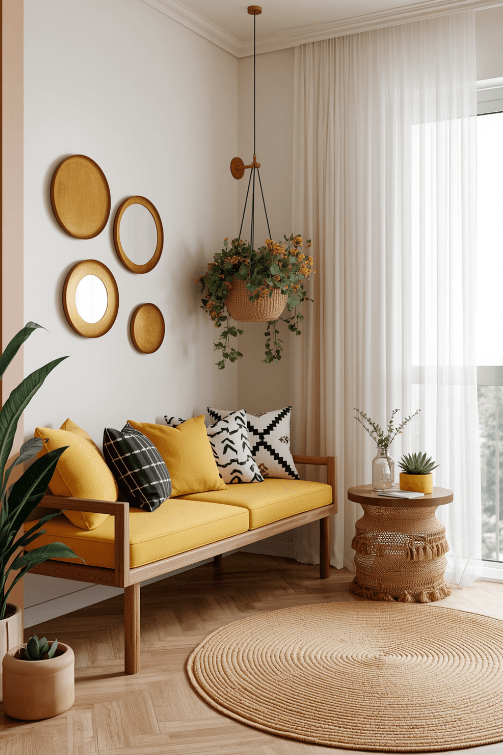 My second attempt used a soft, muted yellow with warm undertones rather than the bright, almost primary yellow I’d originally chosen. Muted tones tend to feel warm and inviting, while highly saturated yellows can quickly veer into overwhelming or even slightly jarring territory on a full wall.
3. Balance yellow walls with plenty of neutral furniture
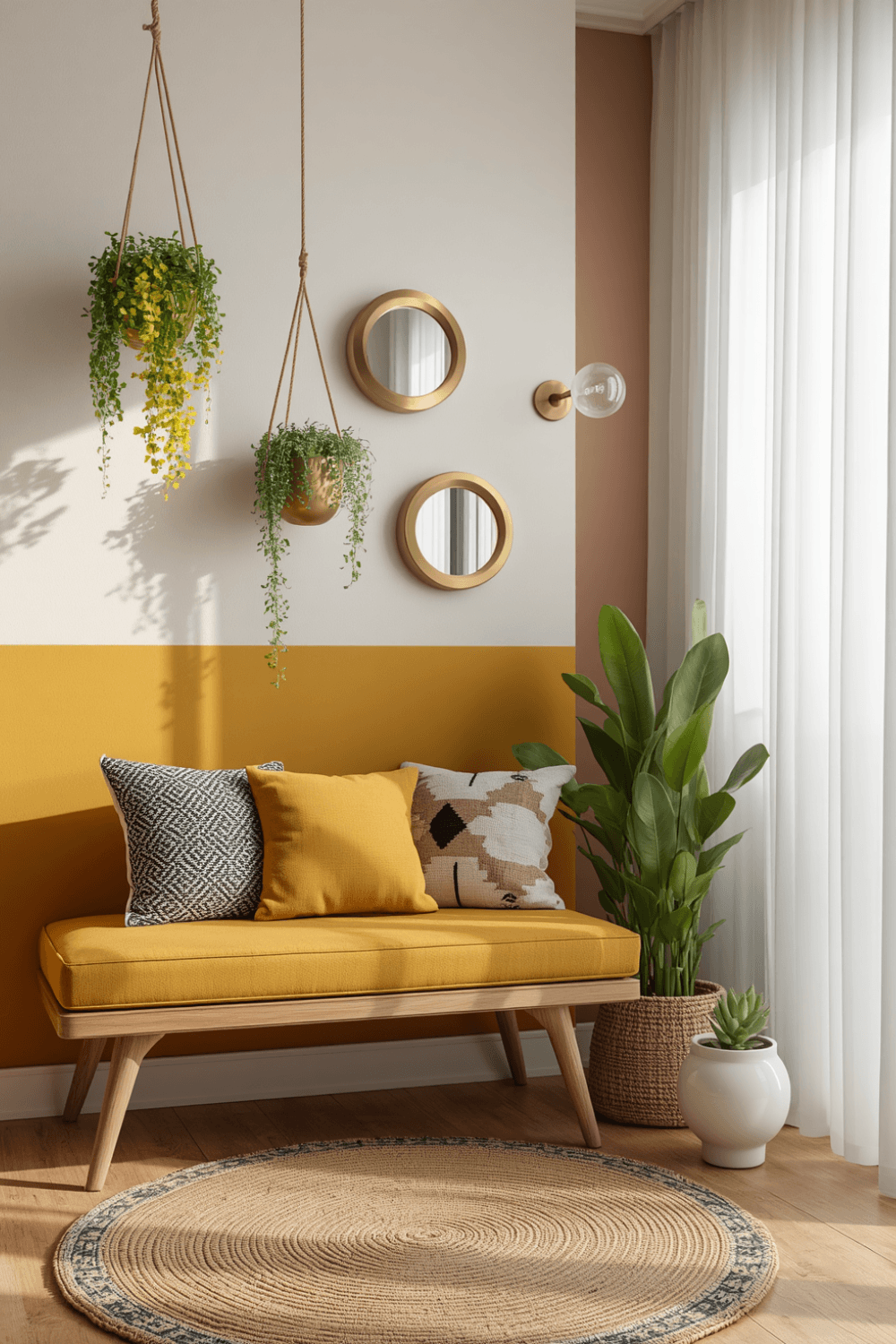 I kept my couch and larger furniture pieces in soft cream and warm gray tones, which gave the yellow walls room to be the statement without competing against equally bold furniture choices. Too much saturated color throughout the whole room can tip quickly from cheerful into overwhelming.
4. Consider using yellow as an accent instead of an entire room
 Rather than repainting all four walls, a friend’s approach that I later borrowed for a guest room used yellow on just one accent wall, keeping the rest of the space in soft neutrals. It’s a lower-commitment way to get that cheerful pop of color without the intensity of a fully yellow room.
5. Add plenty of white or cream trim to balance the color
I made sure my trim, baseboards, and ceiling stayed a crisp white rather than getting swallowed by more yellow throughout the room. That contrast gives the eye somewhere to rest and keeps the yellow from feeling like it’s closing in on the space.
6. Pair yellow with natural wood tones for warmth
I added wood furniture pieces, a coffee table and a bookshelf, which complemented the warm undertones in my chosen yellow far better than the cooler metal and glass pieces I’d originally had in the room. Natural materials tend to soften and warm up a yellow room rather than competing with it.
7. Test your final choice against your actual textiles
I brought a paint sample and held it against my rug and curtain fabric before finalizing anything, since undertones in yellow paint can clash more than expected with existing textiles that have their own subtle color casts. This step caught a potential mismatch before I’d committed to painting.
Real Examples That Actually Work
A friend used a soft mustard yellow on her living room’s built-in bookshelves instead of the walls themselves, paired with white walls and warm wood furniture throughout. It gave a genuine pop of color and personality without the intensity of a fully yellow room, and it’s proven easy to update if her taste shifts later.
Another friend went bolder with a full soft yellow room but balanced it heavily with black accents, a black coffee table, black picture frames, and black lamp bases, which kept the overall look feeling intentional and grounded rather than overly sweet or saturated.
Common Mistakes to Avoid
Choosing a bright, saturated shade without testing large swatches first. Yellow shifts more dramatically under different lighting than most other colors, making this step especially important.
Pairing yellow walls with equally bold furniture and accessories. It can tip the room from cheerful into visually overwhelming fast.
Skipping white or cream trim as a visual break. Contrast trim keeps yellow from feeling like it’s closing in on the room.
Ignoring how your chosen yellow interacts with existing textiles. Undertones can clash more than expected once everything is actually in the same room together.
Committing to a full room without considering an accent approach first. Using yellow more selectively is a lower-risk way to test whether the color truly works for your specific space.
Final Thoughts
My yellow living room taught me that this particular color needs more careful testing and more intentional balance than most other paint choices. The difference between my original overwhelming shade and my eventual muted, warm repaint came down almost entirely to actual testing and thoughtful pairing rather than the color itself being wrong.
If you’re drawn to a yellow living room, lean toward muted, buttery tones, test large swatches in your actual lighting, and balance the color with plenty of neutrals and natural wood. That combination is really what separates a genuinely warm, inviting yellow room from one that ends up feeling more like a school bus than sunshine.