Colorful Bathroom Decor Ideas: What I Learned After Getting Way Too Bold (Then Toning It Down)
A few years back I painted my bathroom a deep emerald green on a random Sunday afternoon because I saw one photo on Pinterest and got way too excited. By Tuesday I hated it. Not because green is a bad color, but because I went in with zero plan and just started rolling paint on the wall like I was in a home makeover show.
That mistake actually taught me more about color than any of the “safe” white or beige bathrooms I’ve done since. If you’re thinking about adding some color to your bathroom, I want to walk you through what actually works, because it’s a little different from just picking your favorite shade off a paint chip.
Why Colorful Bathrooms Are Having a Moment
For years, bathrooms were treated like the one room you weren’t allowed to have fun with. White tile, white walls, maybe a gray towel if you were feeling wild. But bathrooms are small, closed-off spaces, which honestly makes them the easiest room in the house to experiment with color without it taking over your whole life.
I’ve noticed this shift a lot on Pinterest and Instagram too — muted sage greens, terracotta, dusty blues, and even deep burgundy bathrooms have been showing up everywhere. It’s not about going crazy with rainbow tile. It’s about picking a color that actually has personality.
My Emerald Green Disaster (And What I Should Have Done Instead)
Here’s what went wrong with my first attempt. I picked the color off a screen, in a completely different lighting setup than my own bathroom, and I painted the entire room in one solid, saturated shade with zero breathing room.
Under my bathroom’s fluorescent lighting, that deep emerald looked almost black by evening. It felt like I was showering in a cave. I ended up repainting it a few months later, and this time I actually planned it properly.
Step-by-Step: Adding Color Without Regretting It
1. Test the color in your actual bathroom lighting
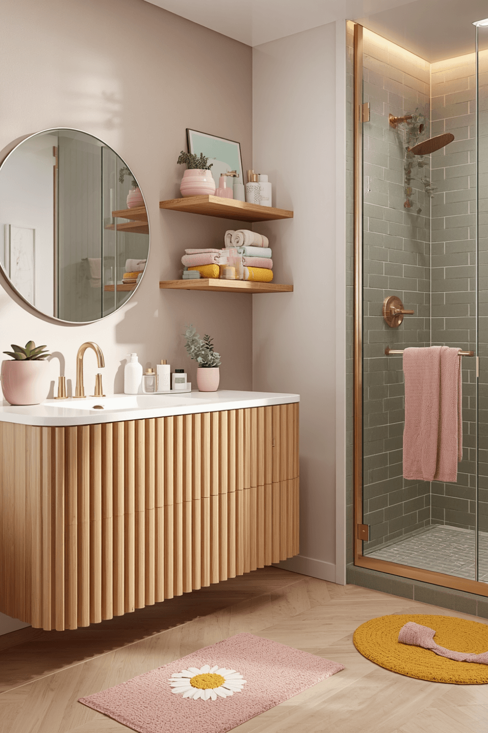
This sounds obvious, but almost nobody does it. I now buy sample pots from Behr or Sherwin-Williams and paint a poster-board swatch instead of the wall directly. I move that swatch around the bathroom and check it under morning light, evening light, and with the vanity lights on. Colors shift more than people expect.
2. Start with an accent wall, not the whole room
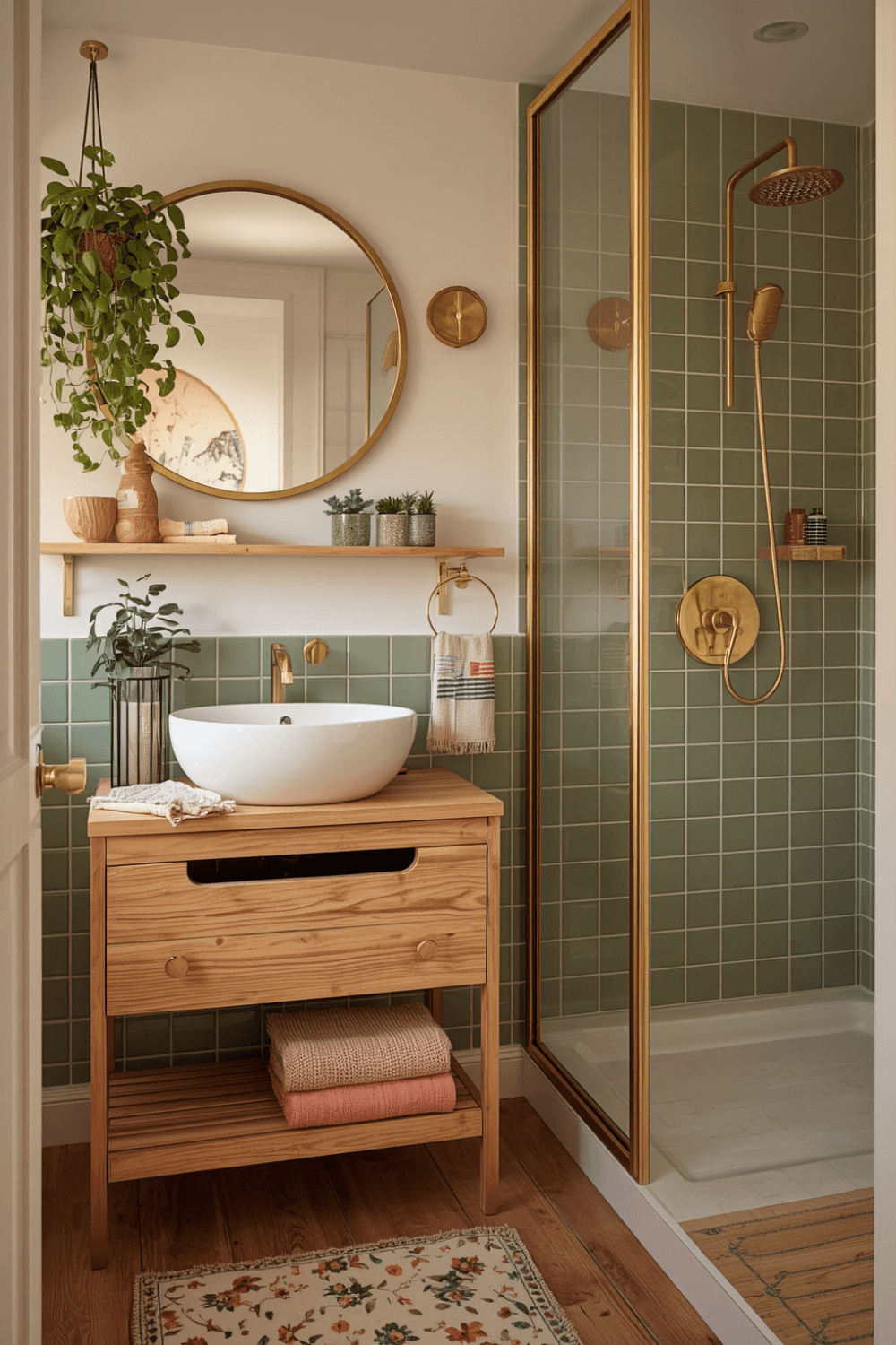
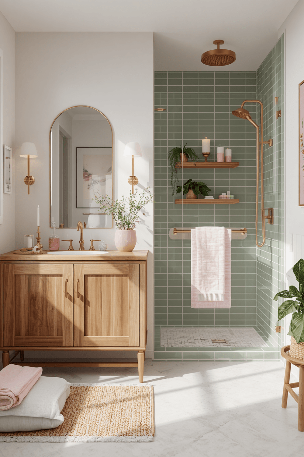
If you’re nervous about commitment, do one wall instead of four. I redid my green bathroom with just the vanity wall in a muted sage instead of the deep emerald, and kept the other three walls a warm white. It gave the room personality without making it feel heavy or dark.
3. Bring in color through things you can change easily
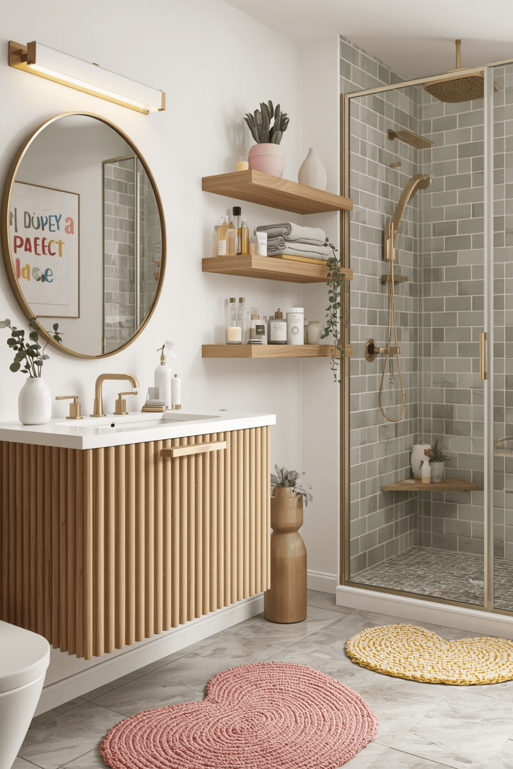
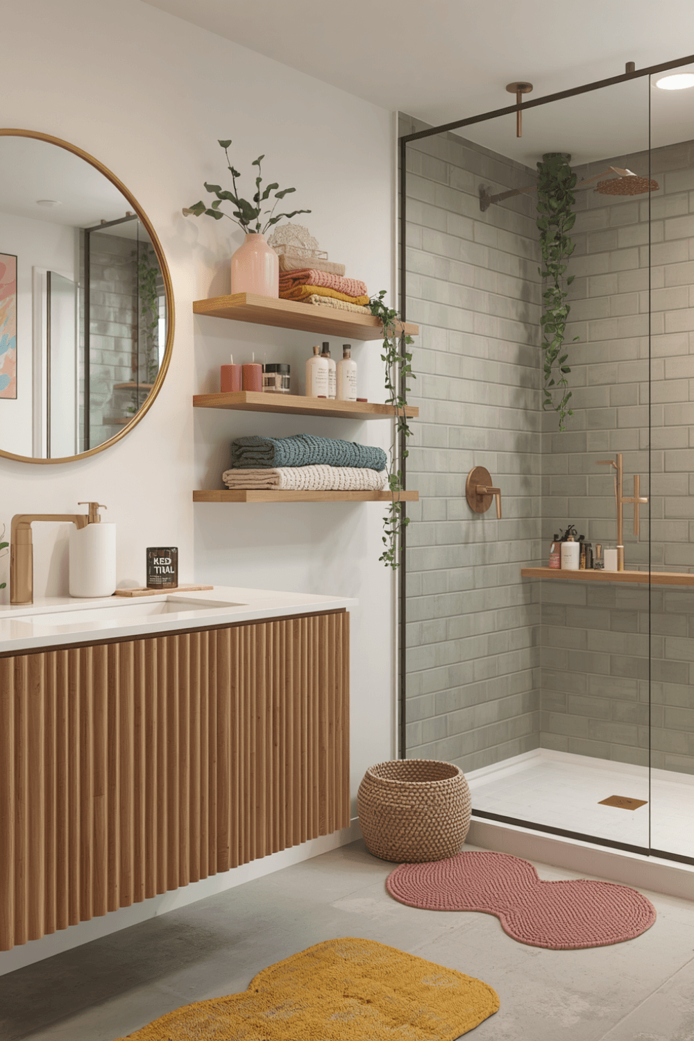
Towels, a shower curtain, a bath mat, and small accessories are the lowest-risk way to test color. I switched my shower curtain to a terracotta pattern from Target and swapped it out with the seasons. If I get tired of it, fix instead of a whole repaint.
4. Balance bold color with a neutral base
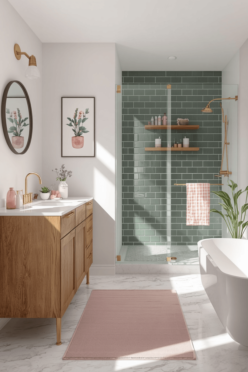
The colorful bathrooms that actually work well usually keep the tile, countertop, and big fixtures neutral, then let paint and accessories carry the color. My sage green wall works because my tile and vanity are still a soft white — the color has room to stand out instead of competing with itself.
5. Use peel-and-stick wallpaper if you’re renting
I helped a friend do this in her rental unit using removable wallpaper from Spoonflower. She picked a small terracotta floral print for one wall, and it completely transformed the space without violating her lease. It took about two hours with a squeegee tool and zero paint.
6. Don’t ignore your grout and fixture colors
This one caught me off guard. My white grout looked slightly warm-toned against the green wall, but slightly cool-toned against a blue test swatch I tried later. If your grout or fixtures have any undertone, it changes how your paint color reads. Bring a grout sample or tile chip with you when picking paint if you can.
Real Examples That Actually Work
A coworker of mine did a small powder room in a deep navy blue with brass fixtures and a single statement light fixture. Because it’s a small, separate room, the bold color doesn’t overwhelm the rest of the house, and it gets more compliments than any other room she’s decorated.
Another friend went with a soft dusty pink in her main bathroom, paired with white subway tile and black matte fixtures. It reads as warm and cozy rather than overly feminine or trendy, mostly because she kept everything else in the room simple.
Common Mistakes to Avoid
Picking a color straight from a photo without testing it in your own space. Lighting changes everything, and what looked perfect online can look completely different on your wall.
Going bold on every surface at once. Colored walls, colored tile, and colored fixtures all together usually feels chaotic instead of intentional. Pick one main element to carry the color.
Ignoring the size of the room. Deep, saturated colors can make a small windowless bathroom feel more cramped. Lighter or muted tones tend to work better in smaller spaces, while bold colors shine in larger or better-lit bathrooms.
Forgetting about resale or rental restrictions. If you’re renting or planning to sell soon, lean toward accessories and removable wallpaper over permanent paint changes.
Rushing the decision. My biggest mistake was painting on a whim. Living with a paint swatch for even a week saves you from a repaint later.
Final Thoughts
Adding color to a bathroom doesn’t have to be an all-or-nothing decision. My first attempt taught me that going bold without a plan just leads to a repaint a few months later, but doing it with some testing and a bit of restraint gave me a room I actually still love years later.
If you’re ready to add some personality to your bathroom, start small, test your lighting, and let one bold element do the talking instead of trying to make every surface loud at once.