Colorful Living Room Ideas: What I Learned After Mixing Way Too Many Bold Colors at Once
A couple of years ago, I decided my living room needed “personality.” So I painted one wall mustard yellow, added a burnt orange couch, and threw in a teal accent chair I found on sale, all in the same month. It looked less like a curated colorful room and more like three different Pinterest boards had a fight in my living room.
I lived with that chaos for almost a year before finally admitting it wasn’t working. Once I actually learned how to layer color intentionally instead of just throwing bold pieces together, the room finally felt vibrant instead of overwhelming. If you’re nervous about adding color to your living room because you’ve seen it go wrong (or done it yourself, like me), here’s what I wish I’d known from the start.
Colorful Doesn’t Mean Chaotic
This was the biggest shift in how I approach color now. A colorful room isn’t about cramming in every bold shade you like. It’s about picking a color story — usually two or three main colors plus neutrals — and then repeating those colors intentionally throughout the space instead of introducing a new bold color with every single piece.
Once I understood that, my “too much” living room started making sense. I had zero repetition. Every bold item was its own isolated color statement instead of part of a connected palette.
Step-by-Step: Adding Color Without It Turning Into Chaos
1. Pick two or three main colors, not five
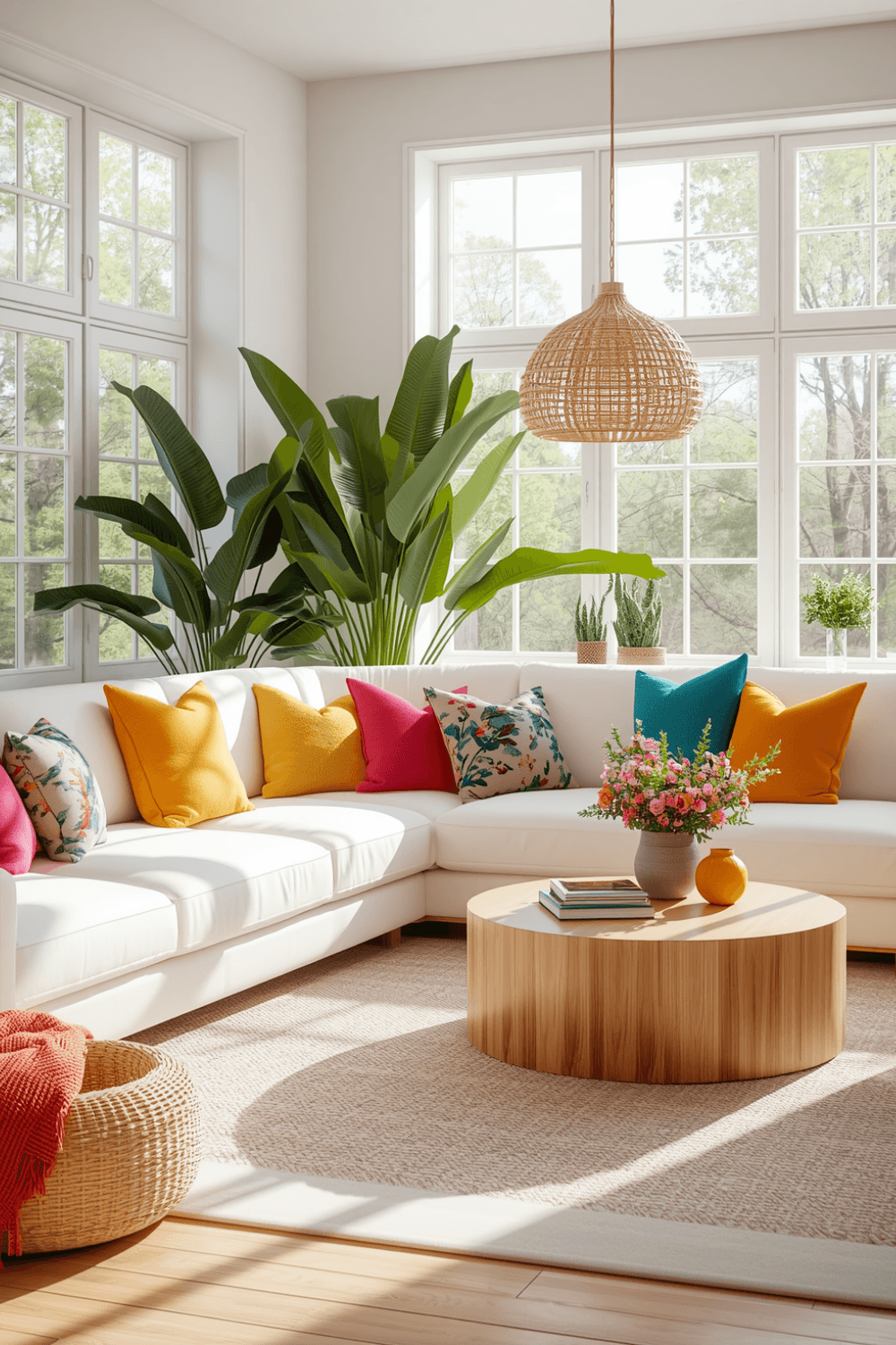
I now stick to a simple rule: one dominant color, one secondary color, and one accent color used more sparingly. For my redo, terracotta became dominant through the rug and one accent chair, deep teal became secondary through pillows and a vase, and a muted gold showed up as small accent touches in frames and small decor pieces.
2. Keep your big furniture pieces more neutral
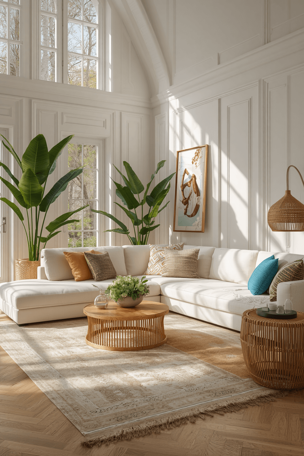
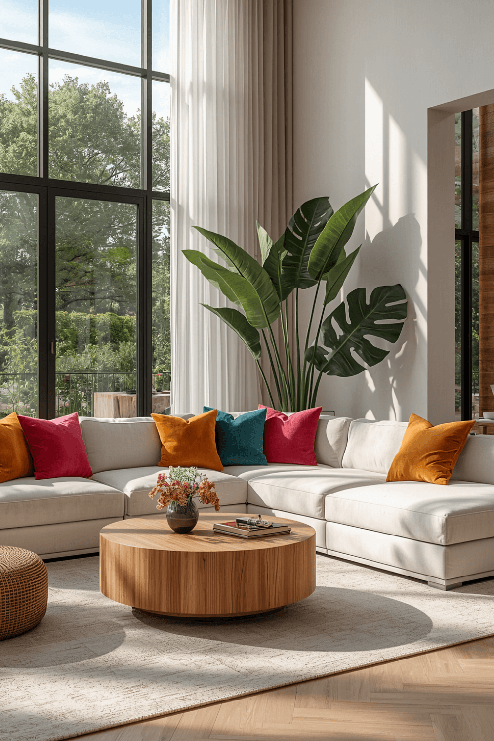
My couch is a warm cream boucle fabric, which gives the eye somewhere to rest between all the bold color moments. If every large surface in the room is a different bold color, it competes instead of complementing. Big pieces neutral, smaller pieces bold, is a formula that’s worked consistently for me since.
3. Repeat your chosen colors at least three times each
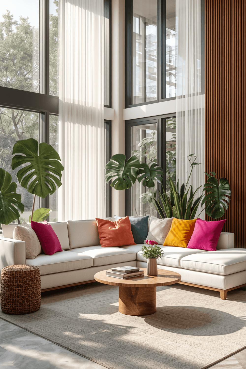
This was the actual fix for my original mistake. I make sure every color in my palette shows up in at least three spots around the room — a pillow, a piece of art, a vase, a throw blanket — so your eye naturally connects them instead of seeing isolated color splashes.
4. Use a color wheel app if you’re unsure what pairs well
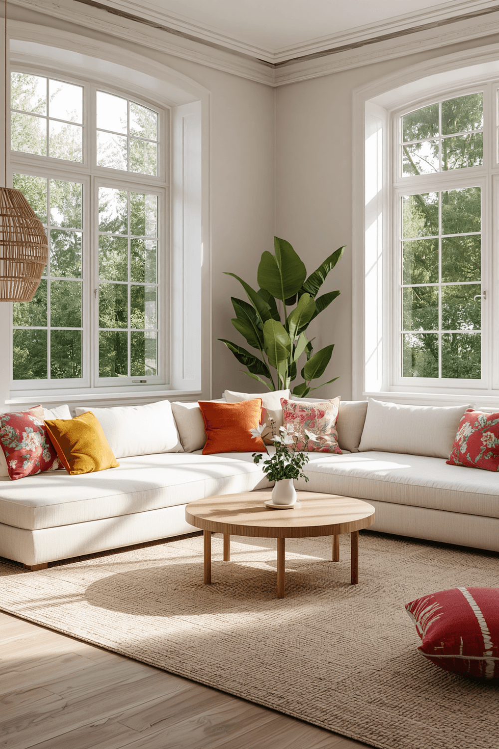
I started using the Adobe Color app to test combinations before buying anything. You can upload a photo of a fabric or paint chip you like, and it’ll generate complementary or analogous color schemes based on it. It sounds a little technical, but it saved me from another mismatched color disaster.
5. Add pattern carefully, using your main colors as the thread
Once my palette was locked in, I added a patterned rug that had both terracotta and teal woven into it. Patterns work great in a colorful room, but only if they pull from colors you’ve already committed to, otherwise they introduce even more competing tones.
6. Balance bold color with plenty of breathing room
I kept my walls a warm off-white instead of also painting them a bold color, since my furniture and accessories were already carrying plenty of boldness. A colorful room still needs visual breathing room, or it starts to feel cluttered instead of vibrant.
7. Test big commitments with smaller pieces first
Before committing to my teal accent chair, I bought a $20 teal throw pillow first and lived with it for a couple of weeks to see if I still loved the color in my actual lighting. It’s a low-risk way to test a bold choice before spending real money on furniture.
Real Examples That Actually Work
A friend of mine did a colorful living room using just two colors — a deep forest green sofa paired with warm rust-orange accents throughout pillows, art, and a vase. Because she stuck to just those two tones plus neutral wood furniture, the space feels bold but calm at the same time, not chaotic.
Another friend went bigger with a color-blocked accent wall — a bold cobalt blue on just one wall — and kept everything else in the room neutral except for a few small yellow accent pieces that pick up warmth from the blue. It’s a great option if you want serious color impact without committing your whole room to it.
Common Mistakes to Avoid
Introducing a new bold color with every single piece. Without repetition, the room reads as random instead of intentional.
Making every large surface a different bold color. Big pieces compete with each other fast; keep at least your major furniture more neutral.
Skipping the testing phase. A bold color that looks great on a paint chip can feel completely different once it’s covering an entire couch or wall.
Adding pattern before locking in your palette. Patterns should reinforce your chosen colors, not introduce new competing tones.
Forgetting breathing room. A colorful room still needs some visual rest, whether that’s neutral walls, a plain rug, or simple furniture shapes.
Final Thoughts
My living room went from a chaotic mix of bold, unrelated colors to a space that actually feels vibrant and put-together, and the difference came down to repetition and restraint, not adding more color. It’s a strange lesson to learn — that a colorful room needs some structure to actually feel exciting instead of exhausting.
If you’re ready to add color to your own living room, pick two or three colors you genuinely love, repeat them intentionally throughout the space, and keep your biggest furniture pieces a little more neutral. That balance is really what makes a colorful room feel curated instead of accidental.